In an AIGA Annual article by Karrie Jacobs, entitled “On Typishness: This is My Theory. My Theory is Wrong,” the author expresses concern that traditions in typography are being threatened as the world shifts from print to screen. The article documents her thought process on the matter and later reveals Jacobs’ conclusion that tradition is never lost, only adapted. As typography advances, new traditions are forged and old traditions are honored. The artists featured in this book exemplify this statement. At one end of the typographic spectrum is the recently deceased Doyald Young, who was a logotype designer and master of formal script. At the other end is Hoefler & Frere-Jones (commonly referred to as H&FJ), the type foundry that continues to shape the world of typeface licensing and webfonts. Through observing the work of Doyald Young and H&FJ, it is evident that older traditions such as hand-drawn script are still relevant in an era that typographic innovation is a necessity.
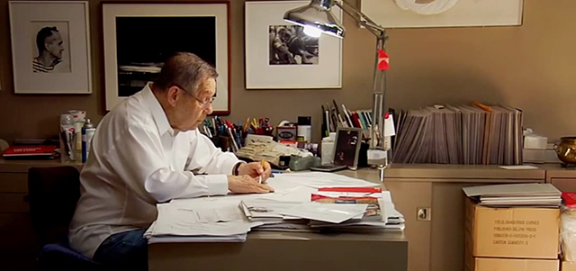
A detail-oriented designer, Doyald Young spent most of his time drawing letters in pencil and ink. His greatness was a product of his discipline. Hand-drawing letters allowed Doyald to gain a deep understanding of form, and through repetition he could command the tiniest shifts in detail. He preferred to start working at a small scale and gradually increase in size or translate his type to the screen through FontLab. He developed several typefaces such as Young Baroque, Young Finesse, and Home Run Script. He has also worked on logotypes for Prudential Financial, General Electric, and the Grammy Awards.
His typefaces, logotypes and script drawings were shaped by typographic tradition: trends in form and ornamentation, variation in stroke width, and decisions that pull from typographic history. The relevance of these traditions today is clear through his acclamation as a type designer. His affinity with typographic tradition stems from his view on the importance of type. Doyald Young once said:
“[Typography] permeates our lives. It permeates our culture. Our history is written with typography.”
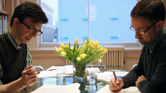
Hoefler & Frere-Jones is a New York City type foundry run by Jonathan Hoefler and Tobias Frere-Jones. They primarily work digitally and their typefaces are crisp and streamlined. Inspired by visual culture, the aim to evoke a certain feeling pulled from said culture, and typographic tradition, H&FJ compile visual examples to help cultivate their faces. Retina, for example, was designed to be used for stock listings in The Wall Street Journal. Optimized for smaller sizes, the design process included referencing over 3,800 newspaper examples. One of H&FJ’s most successful faces, Gotham, was inspired by 1930’s lettering found in Manhattan signage archived in a collection of photographs. Originally designed for GQ Magazine in 2000, Gotham was used for the 2008 Barack Obama Campaign and the Freedom Tower amongst other projects. There are well-designed typefaces that are effective for a variety of applications. However, type designers often design faces to convey messages that appeal to the times. Discussing the stability of the profession, Jonathan Hoefler states:
“With different types of content out in the world and the need to speak in different ways I think there will always be a need for new typefaces.”
The type foundry continues to shape the world of type as it further treks into the digital age. They are adapting their type library to the screen through their web fonts service, cloud.typography. Their faces that honor typographic tradition will finally be accessible to the web in an optimized format.
In a reality that is constantly innovating, tradition is still honored in typography. Whether old trends are used directly or influence new trends, they are not shelved. We build off of traditions to establish new ones, while retaining those most significant to type’s history.