His body of work is so elegant, so distinctive, so perfect, that it transcends logo design, transcends the craft of making letters, and rises to a higher place, a place where letters dance with art. But you wouldn’t know this by talking to Doyald Young. Young walks across the living room of his Sherman Oaks home, sets down a book, and sits across from a visitor. He wears jeans and a dress shirt. Young is exceedingly gracious. I’m here to interview him, but instead, Young asks me questions and listens intently. He doesn’t talk about himself, his work, or his books. His modesty is memorable.
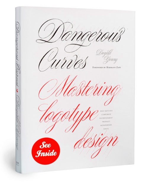
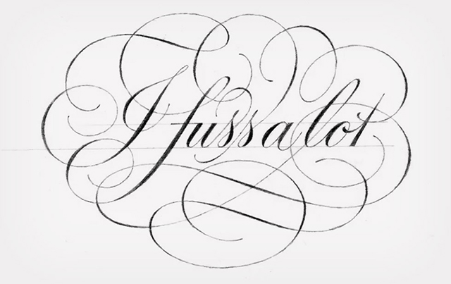
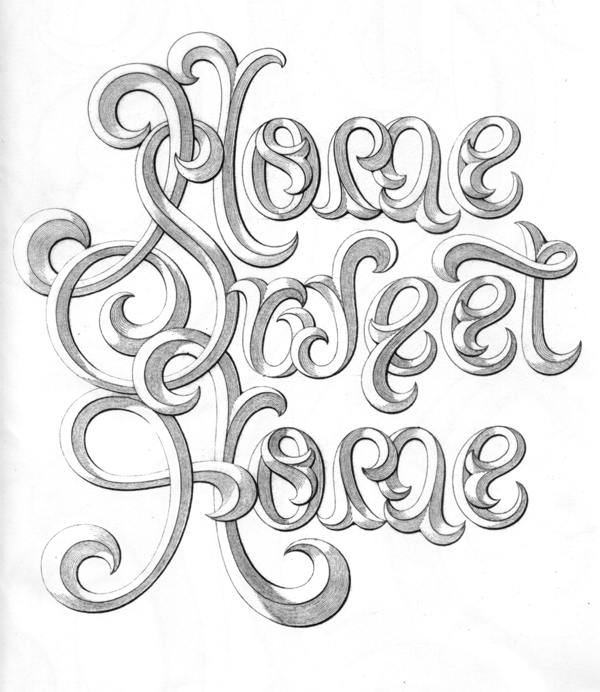
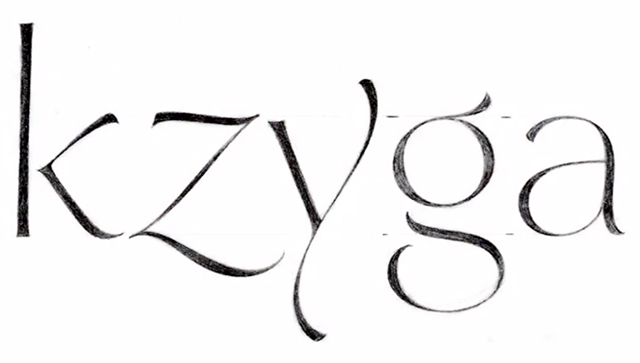
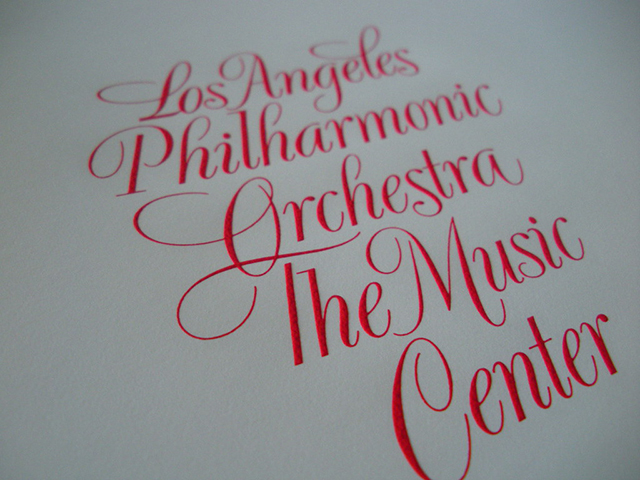
Eventually, we do discuss his new book, entitled Dangerous Curves, a self-published retrospective featuring hundreds of his sketches—logotypes, monograms, titles, and typefaces. The book is a dazzling exhibition of Young’s skill with a pencil, his discipline, his knowledge of form and nuance, and his affinity for beautiful curves. If Matthew Carter is the greatest living type designer, and Hermann Zapf the greatest living calligrapher, Young completes the trinity as the greatest living designer of logotypes.
Young’s influence is widespread. Besides his actual work, for a variety of big-name clients, Young has had a profound impact as an educator. In 30+ years at Art Center in Pasadena, California, he has taught more than 4,000 students, instilling in them the attention to detail taught by his teacher, Mortimer Leach. He’s lectured extensively, and his books have become the de facto textbook for many instructors teaching typography and lettering. The books themselves are special. Young designs the books, oversees the high-quality printing in Hong Kong, and distributes and markets them himself. His last three books have all drawn high praise. Lettering artist John Langdon called Fonts & Logos “the bible, the map, and the Rosetta Stone for those who would carry this low-profile high art into the twenty-first century.” At age 82, Young continues to draw letters and logotypes, gives lectures, teaches an occasional class, and often, he says, you can find him in the role of shipping clerk, standing in line at the post office to send out more book orders. I ask him if another book is in his future, and he smiles.
“You never know.”
The following is an interview with Doyald Young published by Lettercult.
How has Dangerous Curves been received?
I’m delighted to say that the reviews have been enthusiastic and I’ve sold cold copies in Scotland, Ireland, England, Sweden, Germany, Turkey, Dubai, Australia, New Zealand, Japan, Okinawa, China, Brazil, and as far north as Yellowknife, Canada.
For a student of someone new to drawing letters, which of your books would you recommend as a starting point?
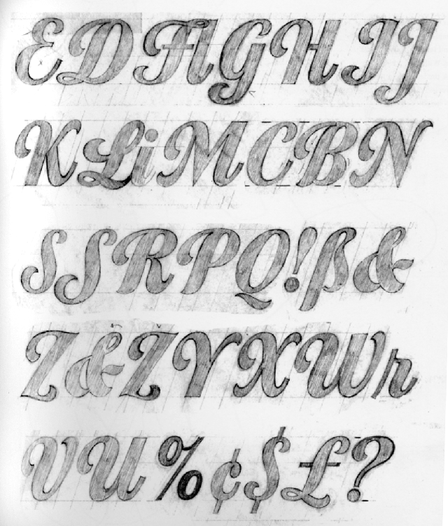
Fonts & Logos because I carefully explain and diagram letters, to show construction and form. Logotypes & Letterforms should be a follow-up because it shows how I style a logo.
Quite a few course instructors have been choosing your books for their classes. Which book in particular seems to be the most popular as a classroom textbook?
Fonts & Logos seems to be the most popular because of its emphasis on typography.
In your books, you describe your method of sketching letters. Can you summarize how you typically work for those who have not seen the books?
I begin rough sketches with a soft HB pencil on tracing paper at a logo’s most commonly used sizes. This is around one and a half inches, smaller sometimes, larger sometimes. Depends on my mood, the style, and the complexity of the design. Then I do tight drawings usually at that size for presentation, and final art in FontLab, rarely in Illustrator.
You have been drawing letters for more than 50 years. Which individual letters do you look forward to drawing?
The lowercase, two-weight roman letter “g” is my favorite.
Do you have a favorite piece of your own work?
I’m most proud of the word Prudential and its limited font.
As an acknowledged perfectionist, do you ever look back at an older piece and see things you’d like to change?
Yes, because I sometimes think of a better way to design it.
You ran away from home in 1942, when you were 15. At that point, had you learned anything in school about lettering and were you aware of the logos and letters around you in more than a cursory sense?
Ms. Dutton, sixth-grade art teacher, had the class design monograms. Yet I don’t see that as beginning awareness. It was Joe Gibbey, my teacher at LA Trade Tech, who truly first opened my eyes to letter forms, and Mort Leach who refined my observation and craftsmanship.
You worked a variety of odd jobs before getting technical illustration. How did that lead to lettering?
Tech illustration didn’t truly fit my sensibilities, though inking performance curves with their necessary precision helped me to understand a curve. I went back to school to learn more about lettering.
How much influence did Mort Leach have on you, as a letterer, and an educator?
Leach was my great teacher. He demanded perfection. I have taught at Art Center since September 1955 until 1978, then from 1997 to the present. I am on hiatus and will teach a spring class.
What other mentors did you have?
Mary Sheridan, Henry Dreyfuss, and Sterling Leach. I’ve written about them in a short piece for the AIGA.
In 1956, while in Amsterdam, you cold-called the great Jan Van Krimpen, and asked if he would meet with you. What were some of the memorable things you took from that encounter?
Strangely, I didn’t take notes during the visit, though I brought John Dreyfus’s book on Van Krimpen and we talked about that. The only vivid thing that I remember in conversation was “there are no rules for a letter’s proportions.” My piece on Van Krimpen is posted on the AIGA (LA) website.
You also met with Adrian Frutiger during that same trip. How did that go, did you meet with other type designers, and did anyone turn down a request for a meeting?
I met with Frutiger and a very dapper Rémy Peignot and we talked at length about his new, as-yet released Univers family. I tried in vain to see Hans Mardersteig in Verona, designer of the beautiful Dante font, who was on holiday. In Amsterdam, I saw Dr. Ovink, a most generous and pleasant man, and in Sheffield, England, I was given a tour of the William Caslon foundry.
On the same trip, at the Paris Bibliotec, miraculously I was able to inspect The Medals of Louis XIVet in Phillipe Granjean’s Romain du Roi, in a closed room with a guard standing behind my back.
Your friend Hermann Zapf composed the introduction to Dangerous Curves. When did you first meet him?
In the 1980's, maybe ’85 or ’88, my memory is faulty. I think it was at an ITC Manhattan exhibition of his work.
You’ve taught 4,000+ students how to draw letters and you’ve seen the students work without computers, and now with computers. How have technological advances changed the way you’ve taught? How have students responded?
I no longer require a student to draw and ink a logo by hand. Instead they work from a scan of a meticulous pencil drawing. My current objection to the procedure is that not enough training is required before the current process. Nik Hafermaas, Art Center’s new Provost, is focusing on more drawing classes.
You’ve been using a computer for 20 years, and you work on your fonts in FontLab. Have you everstarted a logotype on a computer, with a mouse, instead of with a pencil or ink?
No, because I find the process clumsy, tedious, and slow moving. Zapf says if you want to design a font, first spend 600 hours on the drawing board before you take it to the screen. I do a rough logo comp in less than a minute.
Why is it important for a logotype NOT to be composed from an existing font?
First, you’ll find many arguments about this. Once, an imperious art director said that “it wasn’t important, after all, there are only two kind of fonts: with feet and without feet.” If you use a font, a client’s competitor has the same opportunity. You have yet to create a unique image.
The need for lettering, and letterers, has waned since the advent of desktop publishing. You told me that you don’t have a crystal ball, but do you think that the pencil-to-paper method of drawing letters will endure down the road?
Probably not. Very few schools in the US, to my knowledge, teach a rigorous program of lettering and design. Art Center once required packaging majors to take 3 semesters of Lettering. Each course was 6 hours, one day a week, for 16 weeks. They were accomplished designers. I spoke at the Royal Academy at the Hague in 2000. Frank Blokland (Dutch Type Library) said that a graphic design course required a student to take lettering for one 8-hour day a week for four years, using first, a flat pen, then pointed, with a pencil, then a font. (Then) ink, then incised in stone, and then to the computer. No wonder Dutch typography is so outstanding!
What’s next for you Doyald?
A few more lectures, a few more select jobs, a few more teaching days—remember I’m 82.
What are five things that people don’t know about you?
I was one of five winners for a Motor Trend automotive design contest. As teenager, I wanted to be a portrait painter. V.S. Naipaul, Elizabeth Hardwick, and Alice Munro are among my favorite authors. Isaiah Berlin and Susan Sontag are my favorite philosophers. Finally, I like Mozart’s chamber music, as well as country music.